
Brand Identity
Inspired by the concept of Rhythms in Motion, we created a brand that celebrates the dynamic flow of storytelling and the deep connection to cultural roots

Grounded in Stories,
Moving Across Cultures
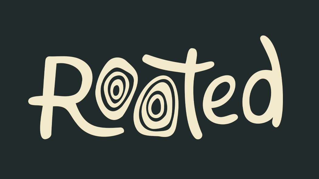
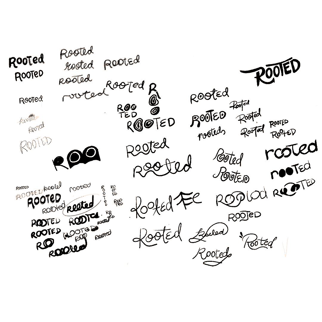
For Rooted, a curated journalism platform, I developed a branding identity inspired by Rhythms in Motion—a concept that blends the deep connections of cultural roots with the dynamic flow of storytelling. The design balances organic, hand-drawn elements with a sense of movement, reflecting the passion, diversity, and ever-evolving narratives that shape our world. Through a warm, earthy color palette and expressive typography, Rooted embodies both tradition and modernity, creating an inviting and authentic brand presence. This project was a collaboration built on shared vision and creativity, crafting a brand that resonates with storytellers and culture-makers alike.

The logo features organic, flowing lines that resemble both the intertwined paths of tree roots and rhythmic waves, creating a sense of movement. It includes subtle nods to the rings of a tree trunk or root systems, merging with abstract lines that flow outward, representing the spread of stories across borders. This balance of grounded and fluid shapes conveys the harmony between wisdom, legacy, and the vibrant exchange of narratives between cultures.
This approach captures both the meaningful depth of the "roots" and the energy and liveliness of "rhythm and motion," making it perfect for Shayne Nuesca’s curated journalism website that values both tradition and cultural exchange.
I love collaborating with passionate people who bring their ideas to life. Whether you have a small spark or a big vision, let’s create something amazing together—reach out anytime!
Here are other similar projects:


